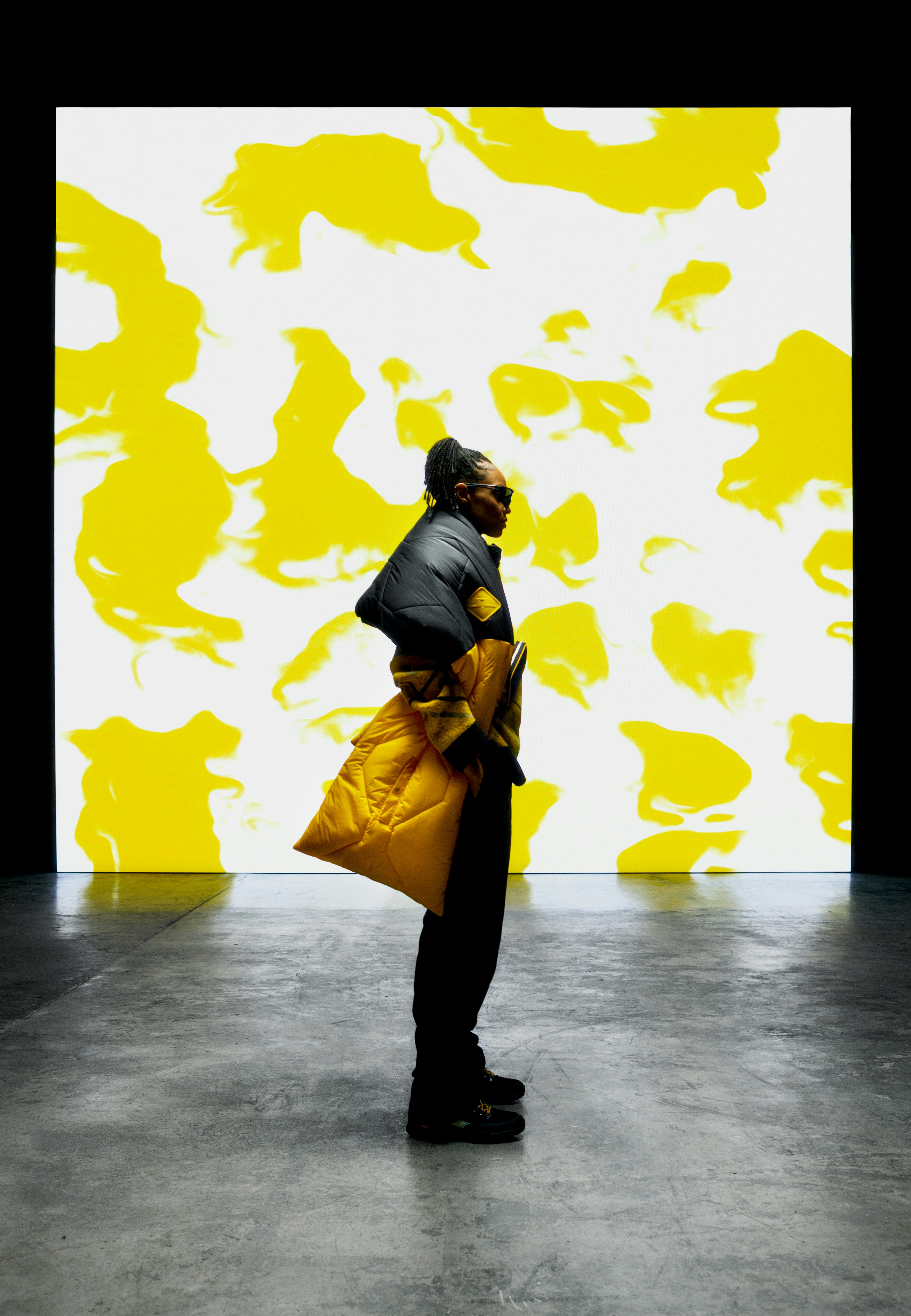
Sandvik is a global, high-tech engineering group providing solutions for the manufacturing, mining and infrastructure industries. The group has 40,000 employees. The Sandvik brand was awarded with the distinction “Red Dot” in the Red Dot Design Award in 2024.
Sandvik
Industry Industrial engineering
Geography Global
Impact Repositioned and looking like a true leader
Lynxeye helped Sandvik emphasize its commitment to lead the shift towards a digitalized and automated industry.
Challenge
After a number of strategic divestments and acquisitions, Sandvik found that there was a mismatch between its new self-image and how it was perceived by key stakeholders, such as shareholders and prospective talent.
Because Sandvik, founded in 1862, is a reinvented company today. It now leads the future of electrification, automation and digitalization within its industries, helping its customers make the shift towards net zero and circular industries.
Sandvik turned to Lynxeye for guidance on how to renew its positioning and transform its identity. The aim was to realize the true potential of the Sandvik brand and, in the end, drive shareholder value.
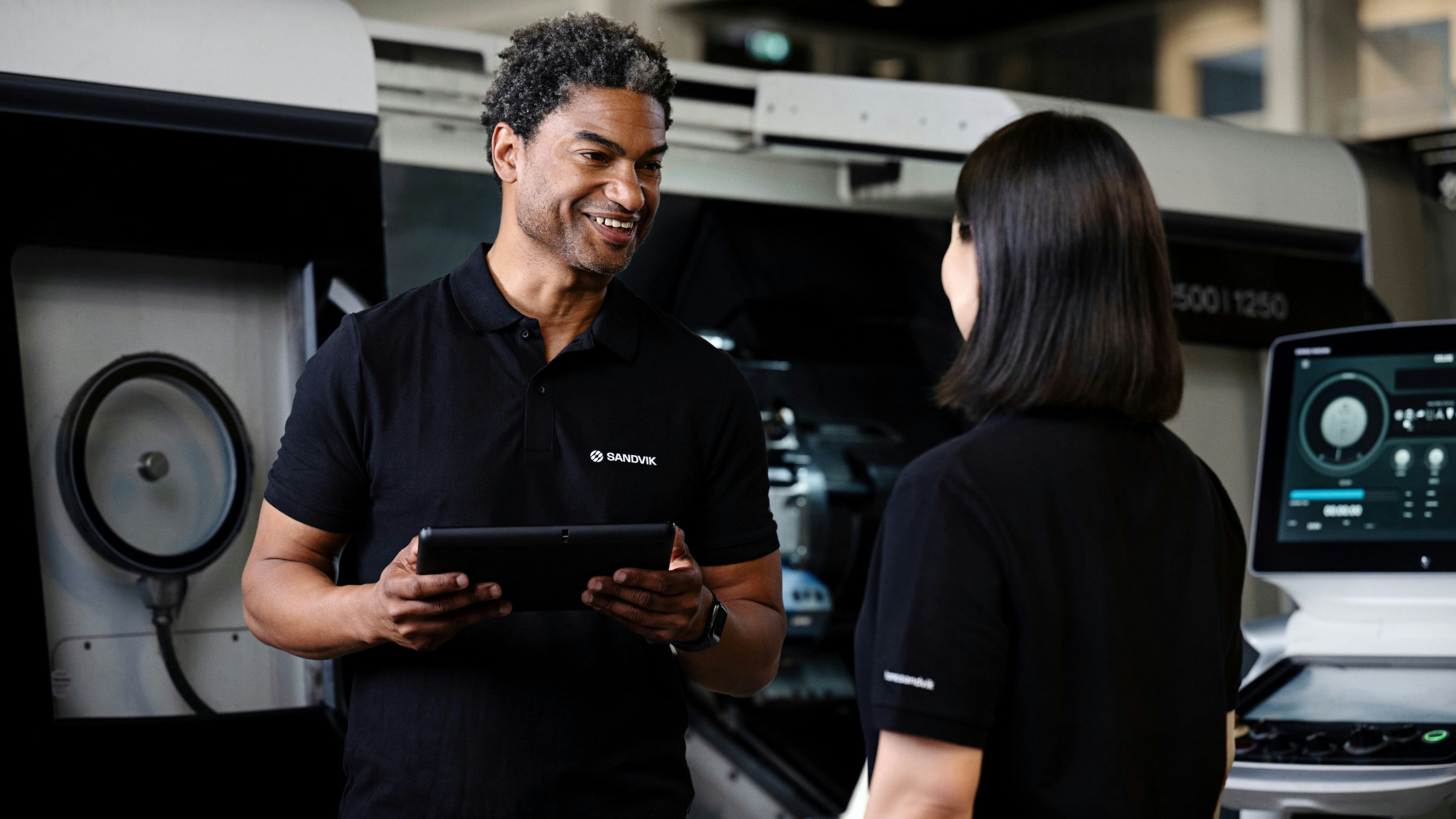
Impact
In 2023, Sandvik is grounded in its purpose to advance the world through engineering, equipped with new brand foundations to guide its next steps, and visually revamped to show its true potential.
Play video
Positioning
Purpose-driven with focus
Sandvik is led by the purpose “We make the shift – advancing the world through engineering.”
Lynxeye worked with the Sandvik team to chisel out three brand foundations, areas where Sandvik needs to excel in order for its purpose to ring true: proactive partnerships, forward-thinking solutions, and sustainable progress.

Brand architecture
Growing without losing consistency
Sandvik needs to be able to develop strong brands that will optimize its market share and ability to reach present and potential customers in an efficient way.
Lynxeye helped set a brand architecture for the group that will ensure a consistently managed portfolio of brands, contribute to the overall brand value, and legally secure and protect I.P.
The brand architecture will be an important tool for M&A purposes, new business development, and when reviewing existing brands in the future.

Brand experience
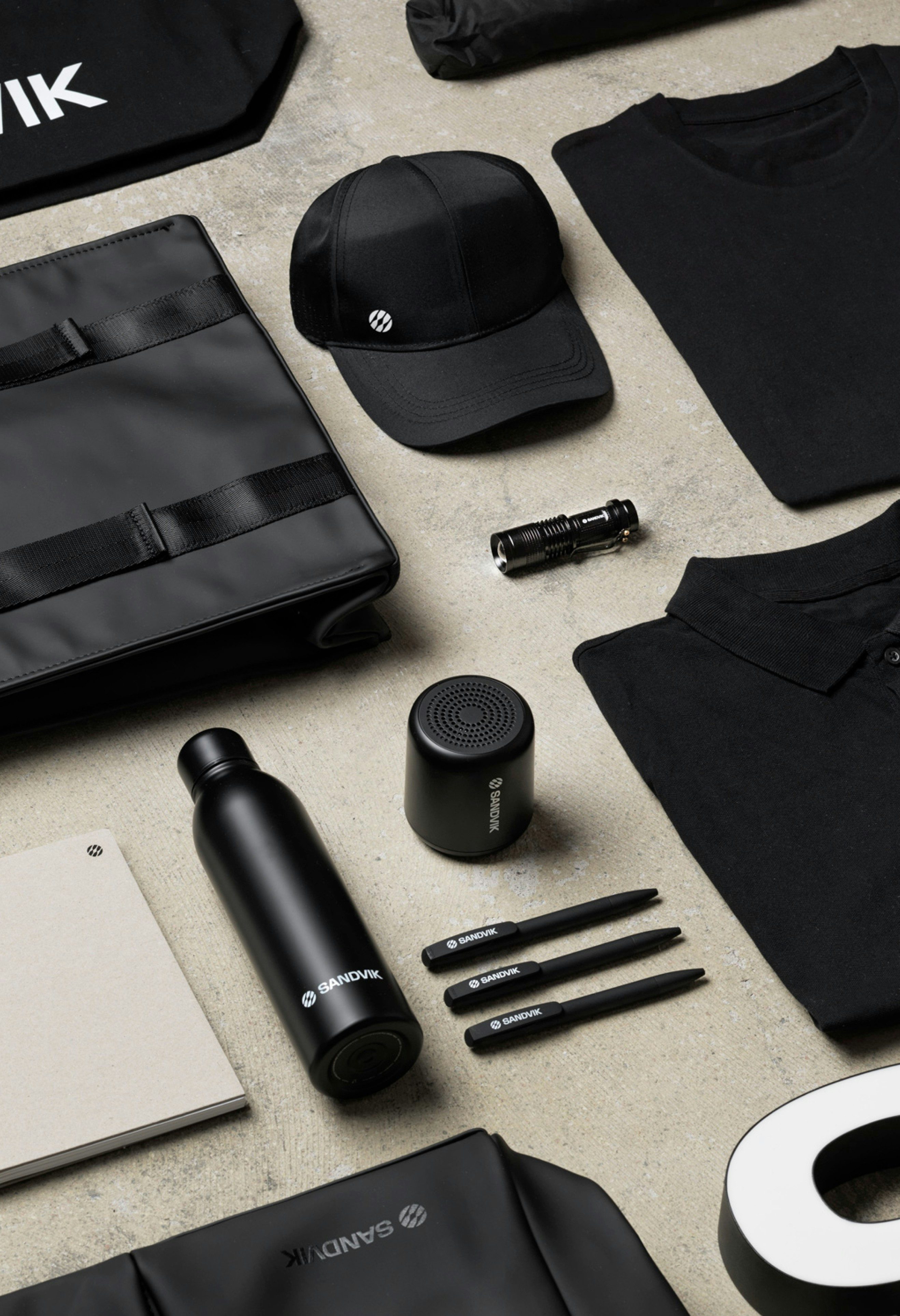
A new logotype, fit for a leader
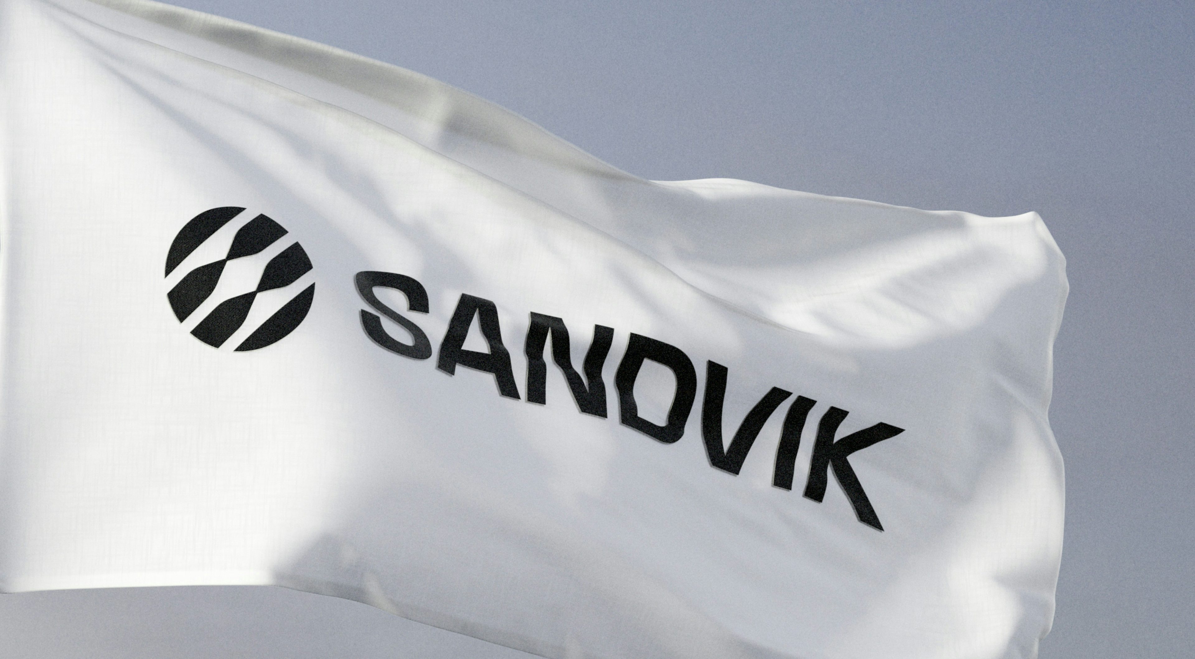
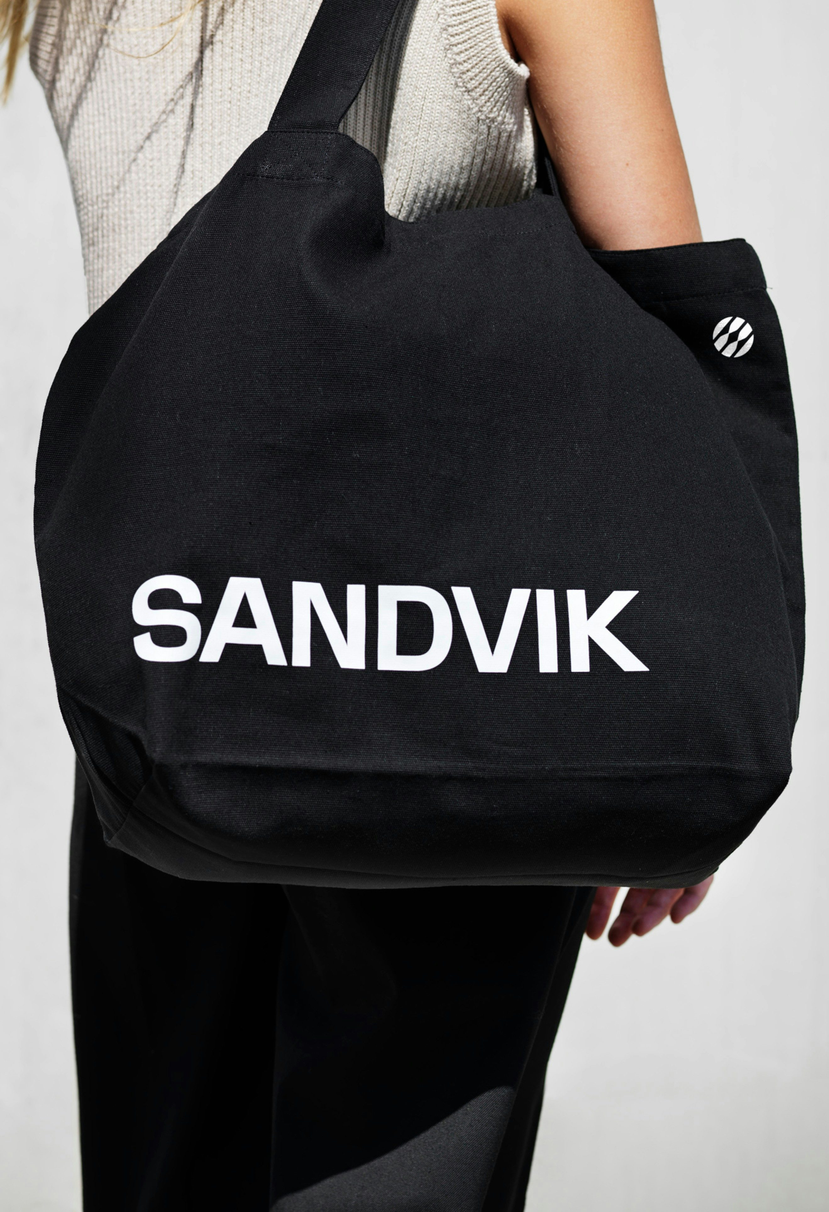
Lynxeye created a new wordmark inspired by the 1962 Sandvik logotype, a tribute to the company heritage and history.
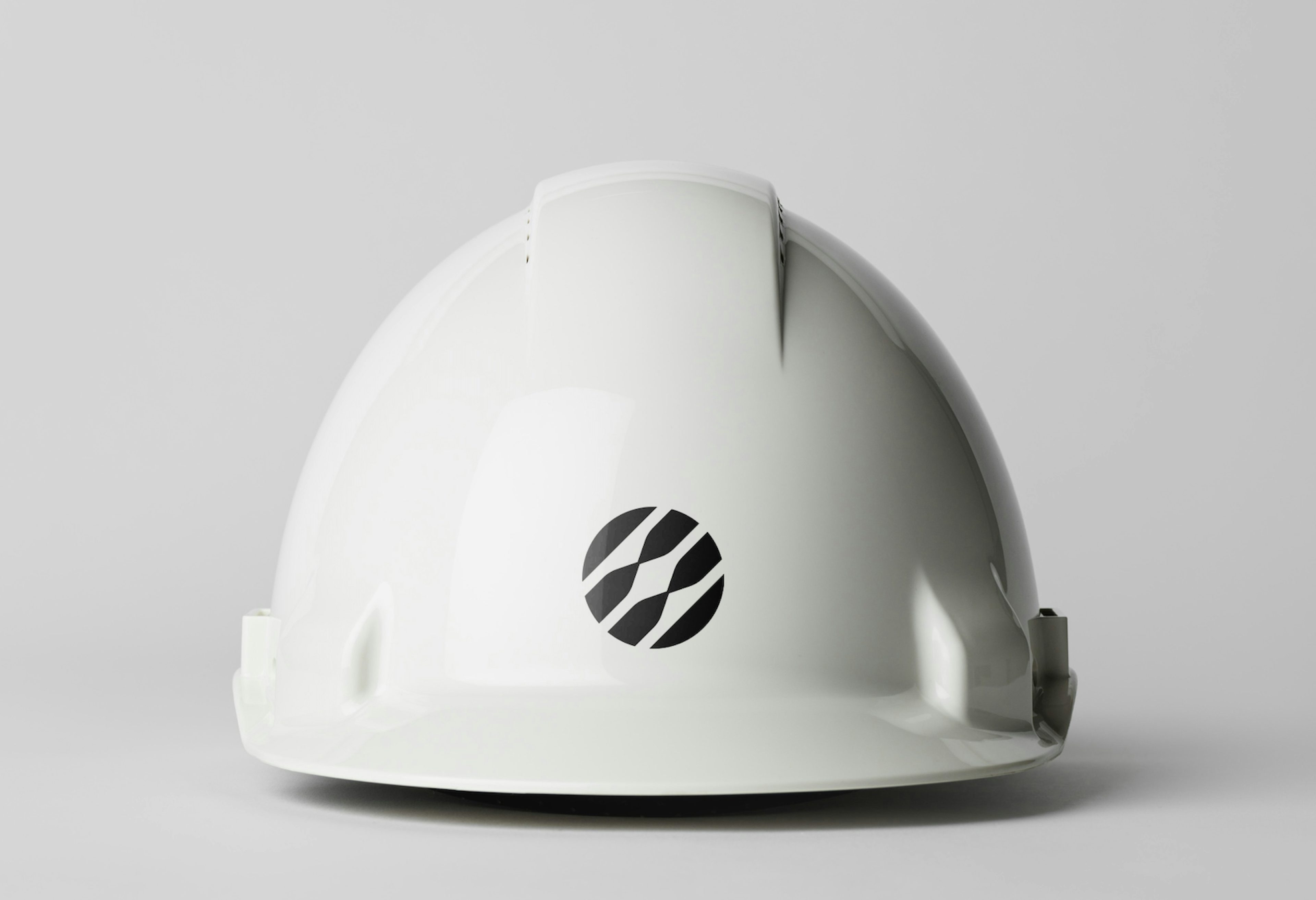
The team also introduces a new symbol, intended as the key bearer of the Sandvik brand and the mark of the corporate purpose. It represents progress and circularity, visually summarizing the commitment of Sandvik to advance the world through engineering.
The Sandvik brand experience is unified by a sonic identity. The sonic logotype is an audible version of the logotype, a representation of the upwards advancement and circular movement.
—We appreciated how Lynxeye were quick to understand our business challenges and the role we as a company and brand want to play in bringing our industry into the future. Our collaboration felt smooth and effortless, and with the expertise from Lynxeye, they also challenged us in a good way. Even though we have a large global organization and many, many people have been involved over the months, the collaboration went well and result was great.
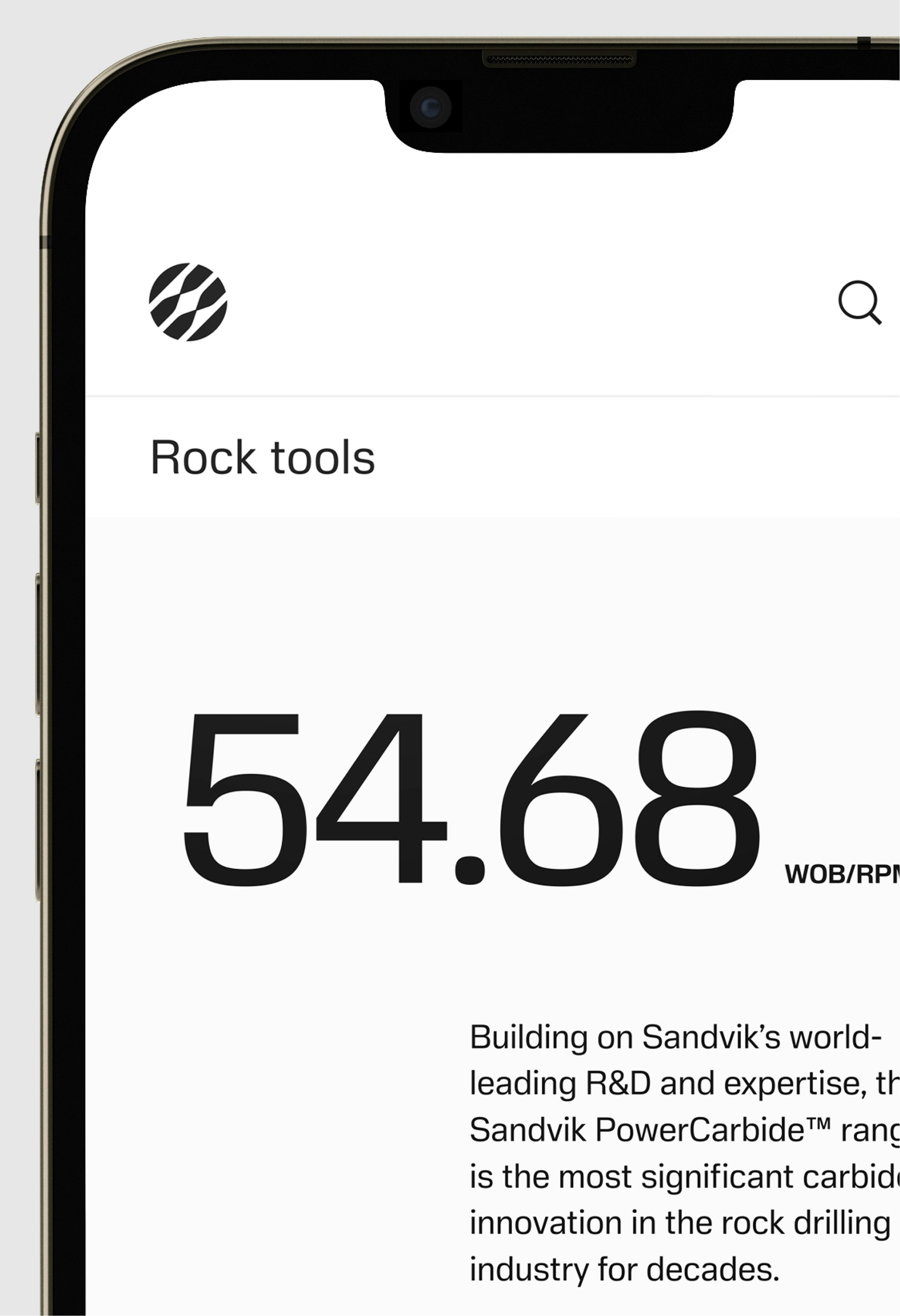
Sandvik Sans is a modern, sans-serif typeface that is exclusively associated with the Sandvik brand.
Curvatures on terminals bring a human touch to otherwise functional letterforms. Superelliptic shapes celebrate the combination of craft and technology.
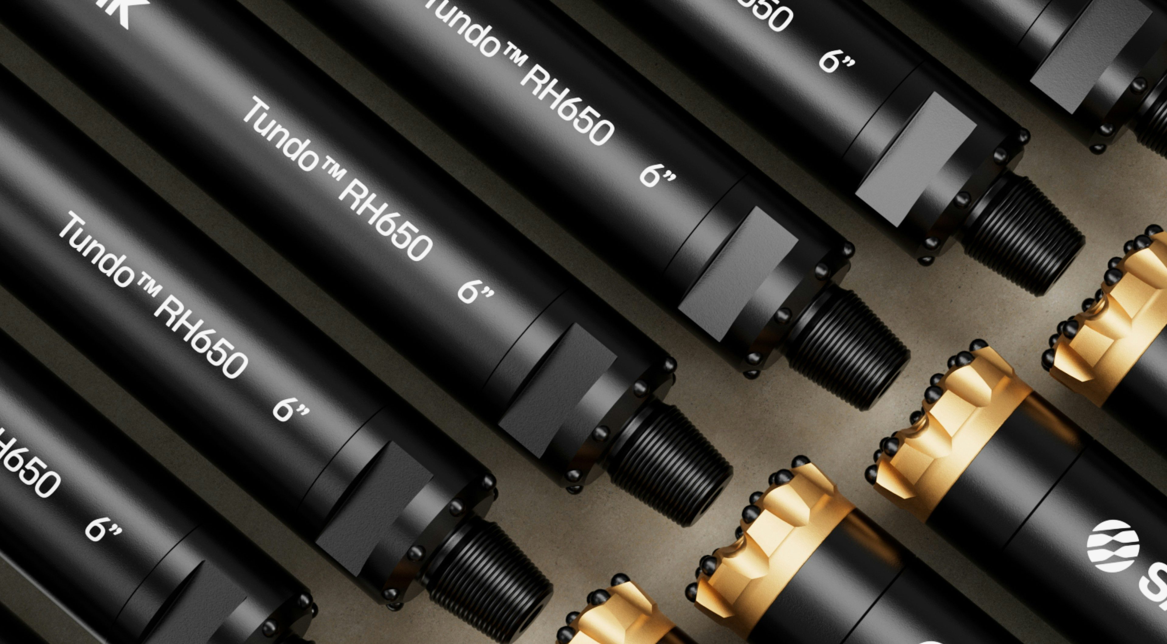
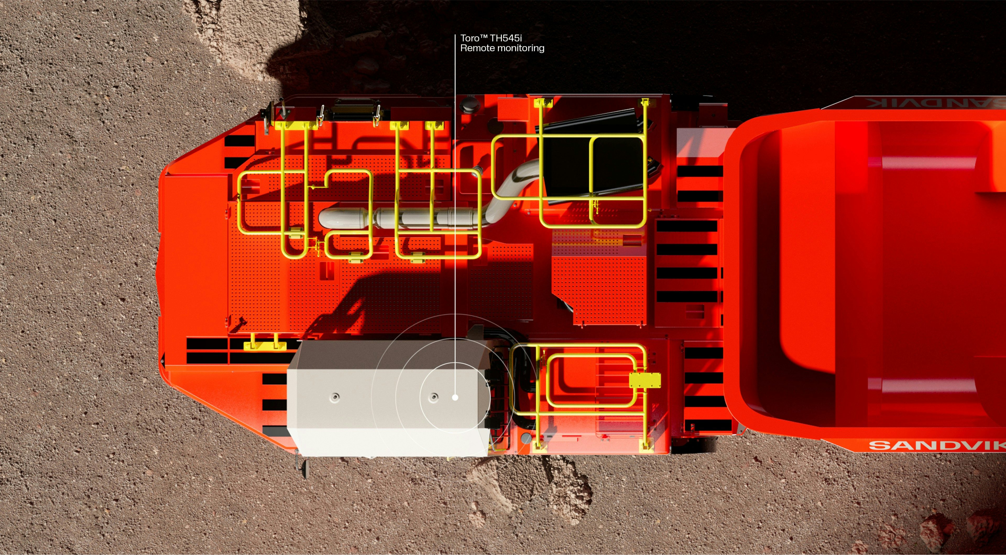
—This partnership was very much about the fine art of striking a balance. 150 years of proud heritage versus planning for the future. The possibilities of a global company versus the limitations of local needs. The wear and tear of a 63-tonnes truck loader versus the precision of tiny turning inserts. Advanced digital solutions versus the most tangible products. The list goes on! That makes the end result very special – something both useful and beautiful. Something extremely well balanced.
Digital experience
Leading digital solutions for Sandvik customers
Sandvik continues to develop its focus on collaboration and co-creation in order to deliver leading digital solutions for its customers.
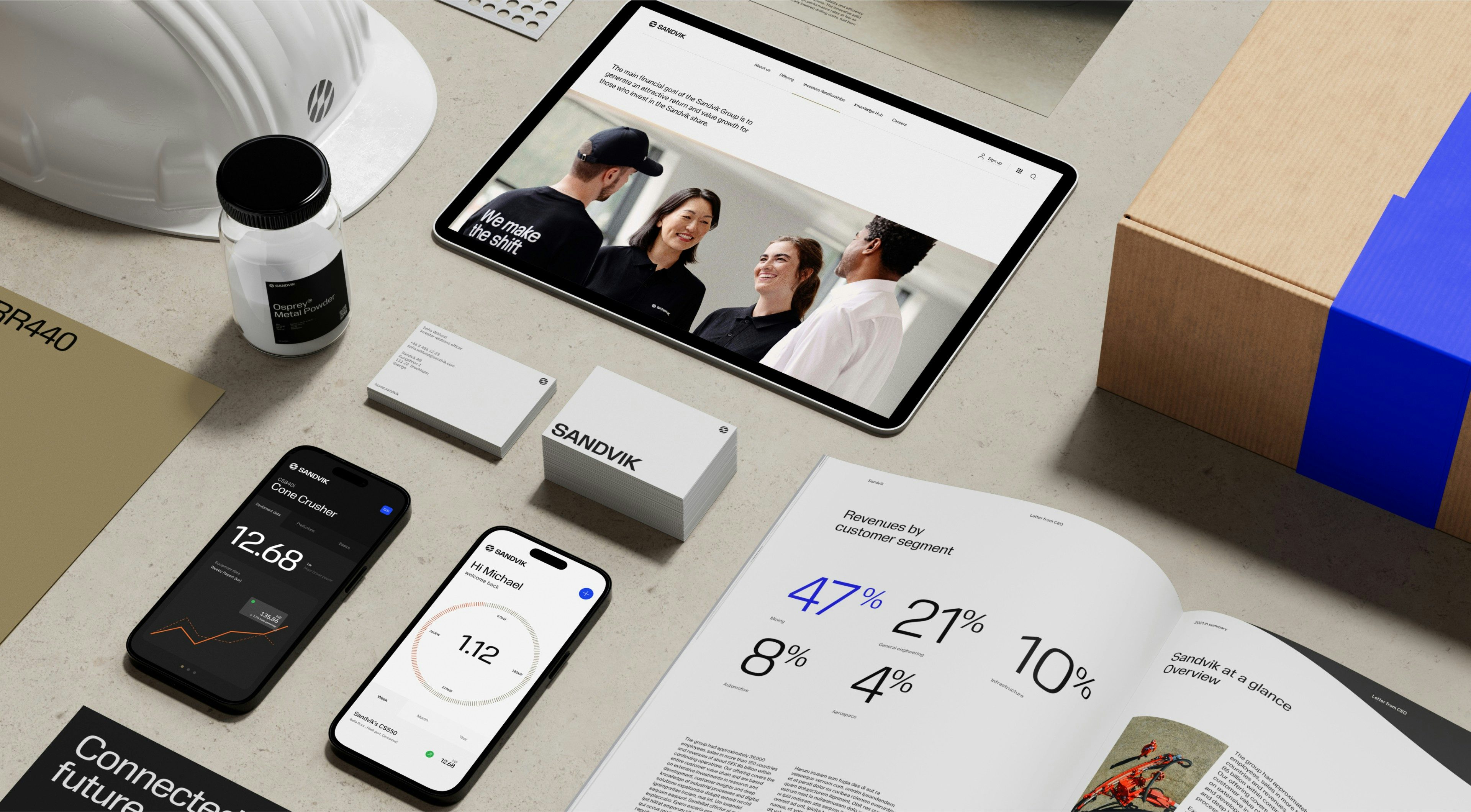
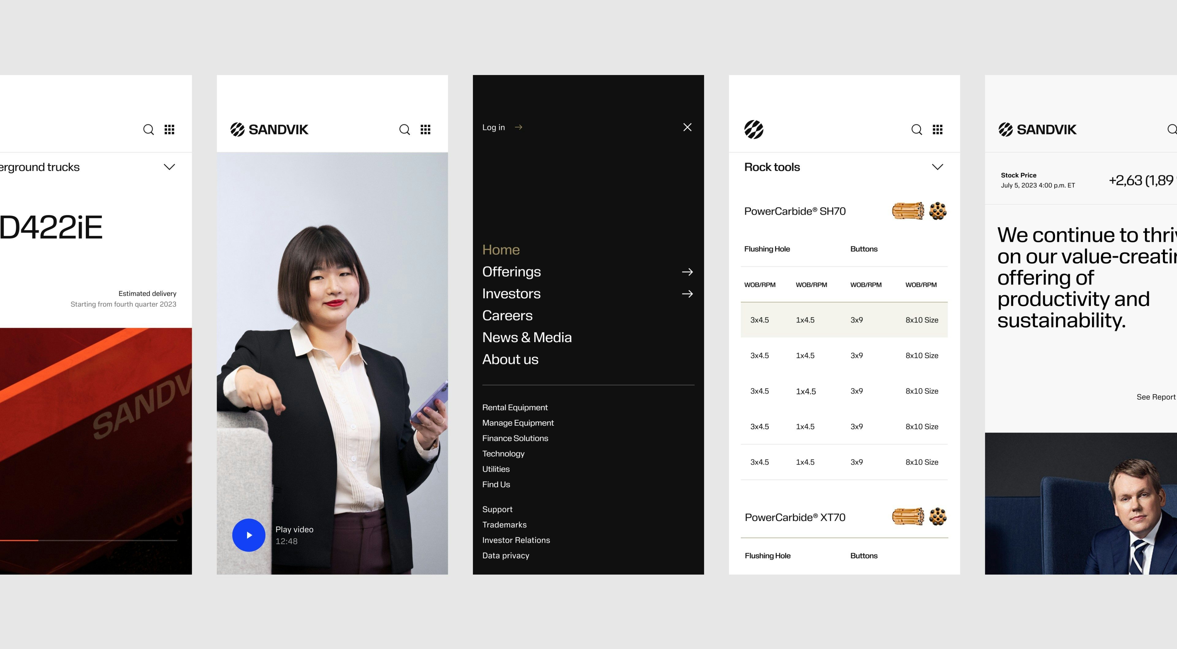
Aiming to make sure all digital touchpoints will create uniform user experiences that live up to the expectations placed on an industry leader, Lynxeye developed digital user interface foundations including a complete U.I. library for Sandvik. It came to immediate use when developing the new Sandvik website.
Sandvik website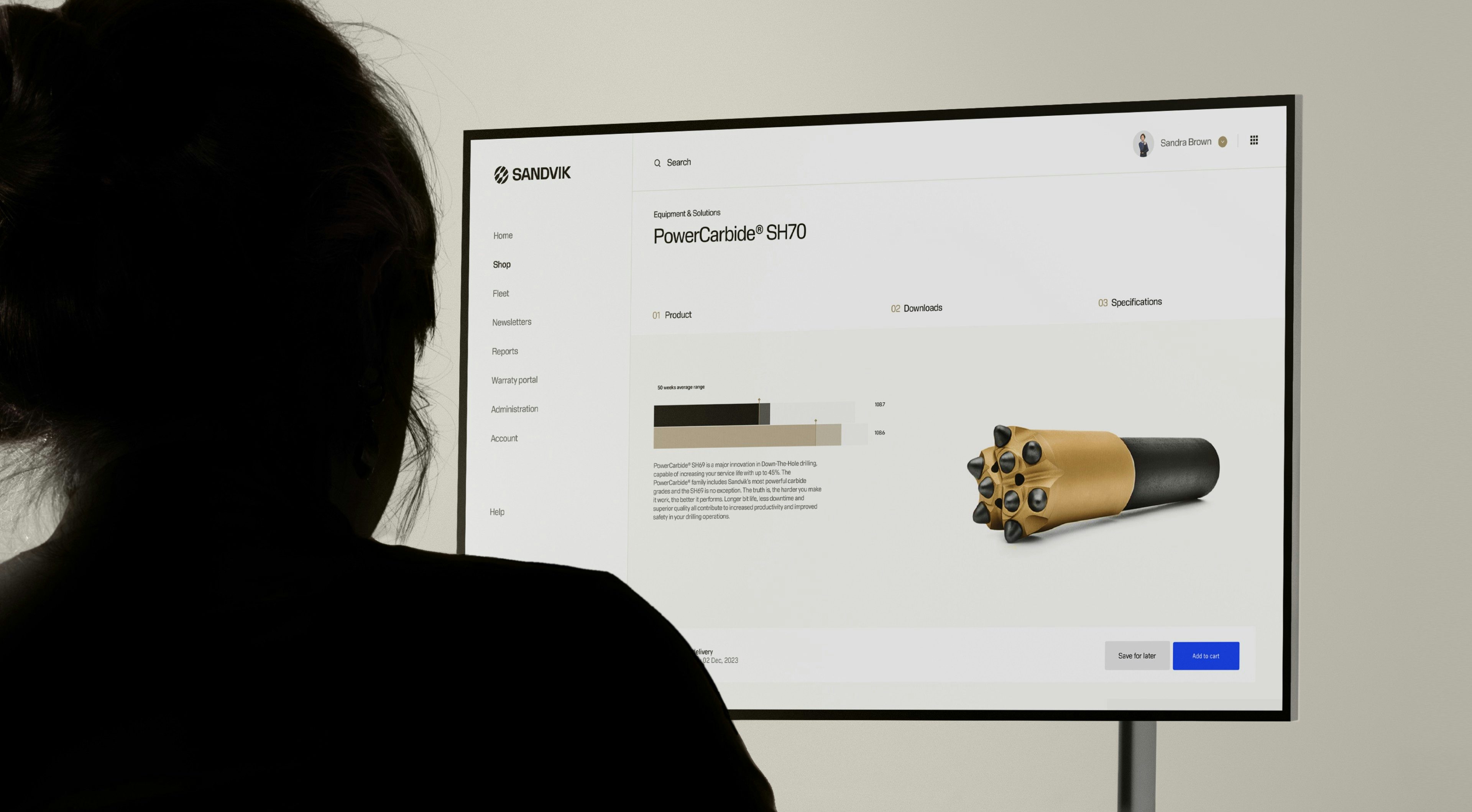
The new color palette is optimized across touchpoints – allowing distinction, and variation across different business areas. The introduction of Gold symbolizes quality throughout Sandvik Group.
Training and roll-out
Smooth and steady execution
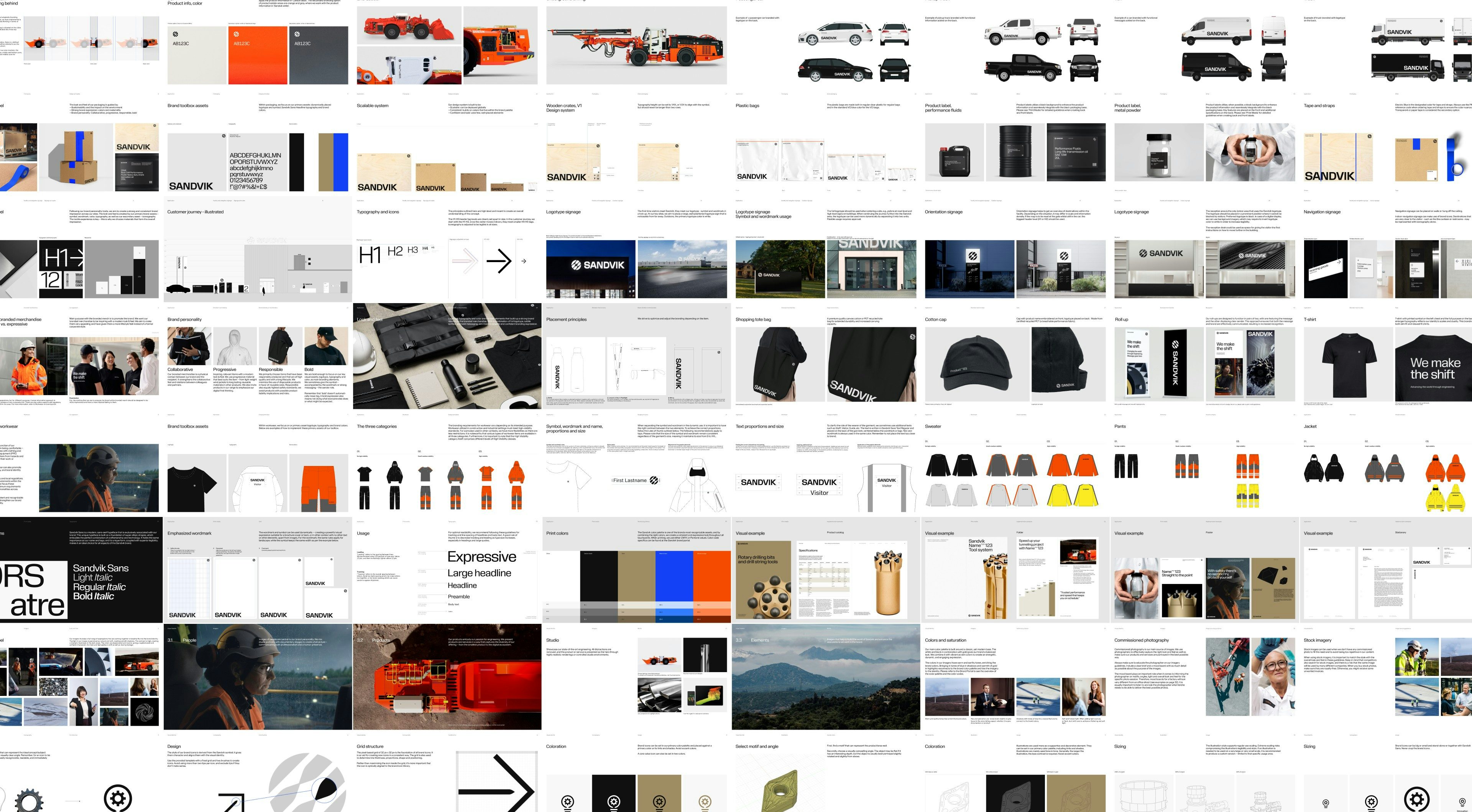
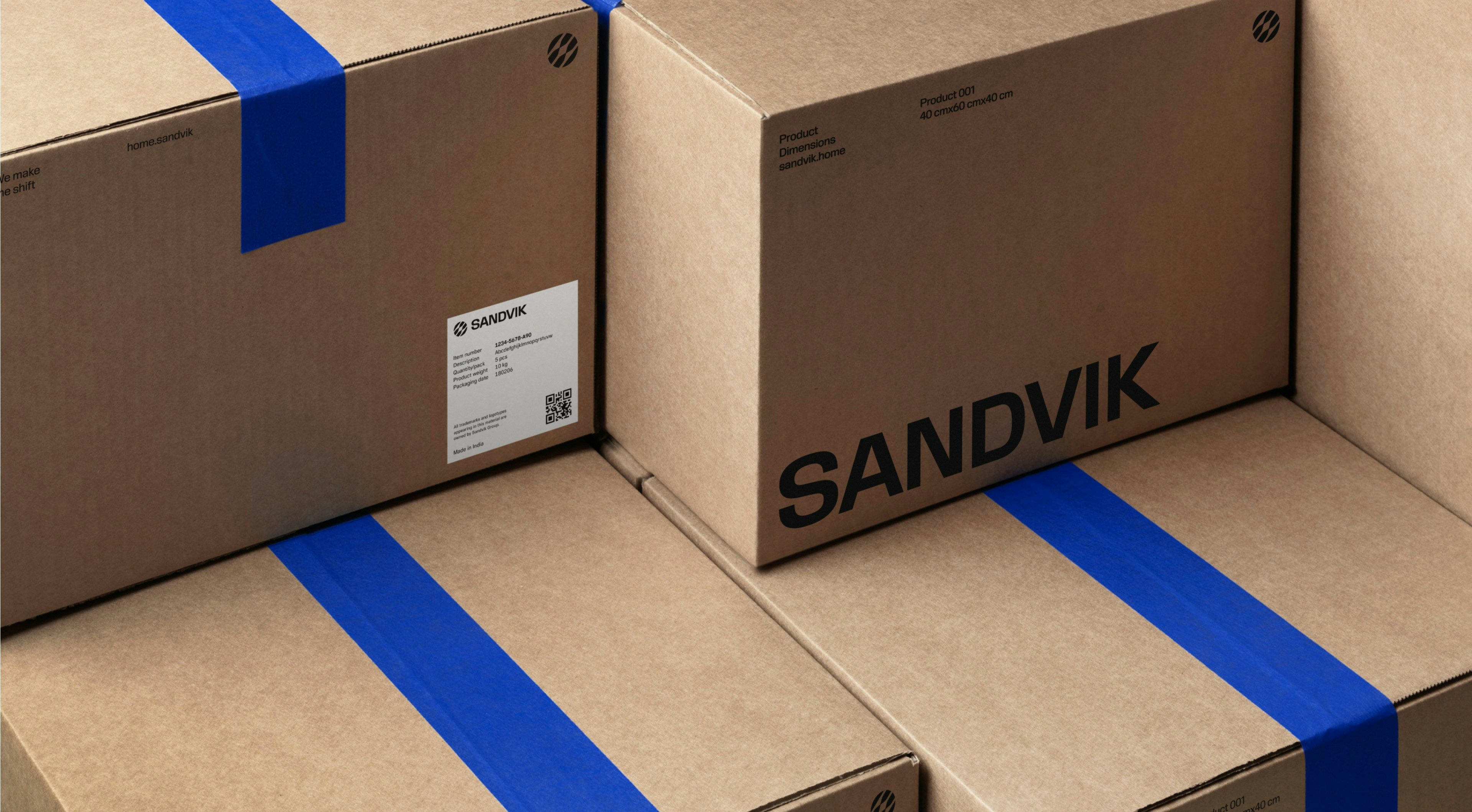
Lynxeye supported Sandvik in the roll-out of the repositioning and new brand identity. This included extensive guidelines and directives, spanning a myriad of physical and digital assets, and involving large parts of the 40,000 strong Sandvik organization.
Demos, training videos and best practice examples available to the Sandvik organization will help ensure a successful initial implementation, return on investment, and a consistent brand experience going forward.
—Working with Sandvik has been a pleasure and truly inspirational for our team. They are moving forward in unison, on a purpose-driven mission to change their own and the industries that they work with. As a bonus for us, they also share our passion for great design and understand the value potential in a well-positioned and well-managed brand. It’s been a fantastic partnership so far.
